UX Design
UX Research
Vista
Cinema Booking App
Irish people are the No. 1 cinemagoers in Europe, yet many of the cinema apps out there are incredibly lacklustre, failing to do the cinematic experience justice. Vista is Ireland’s answer to mediocre and cluttered cinema apps.
Tools: Figma
Problem Statement
As a movie-goer, navigating the cinema experience through many Irish cinema apps is cumbersome, uninspiring, and lacks intuitive design. This can lead to a range of issues, such as:
Difficulty finding the relevant movie information
Frustrations when trying to book tickets quickly and efficiently
The antithesis of a seamless experience from booking to screening
Low brand impact
All these issues can lead to a potential decrease in engagement and loss of revenue for the cinema.
Screenshots from three popular cinema apps in Ireland.
Hypothesis Statement
Encouraging an in-app community of amateur film critics, gamifying the cinema experience, and prioritising brand impact and consistency will lead to a 30% increase in customer lifetime value and an enhanced user experience.
My hypothesis is grounded on the belief that creating a community environment can generate a strong connection to the Vista cinema app. Through public profiles, I aim to establish a platform where users feel their contributions are valued by both Vista and their fellow cinemagoers.
I predict that users who engage in writing and reading in-app film reviews will develop a preference for Vista as a provider, drawn by the opportunities for online engagement, influence, and the potential for discounts and offers, thus further fostering loyalty to the company.
Process
Empathize
1
Define
2
Ideate
3
Prototype
4
Test
5
Empathise
Empathise
Understanding the Audience
Irish people go more frequently to the cinema than anyone else in the EU, so cinemas are in no shortage of customers. However, how do these customers currently experience the available apps, and do they do justice to the cinema experience?
The user research conducted aimed to understand the behaviours, needs, and motivations of frequent cinema attendees through a combination of qualitative and quantitative analysis. The qualitative research included 10 interviews with regular cinemagoers alongside app store reviews, while the quantitative analysis was carried out through a survey of 40 participants. My research was based on two popular cinema booking apps in Ireland.
Reviews
I thought a good place to start was to look at some app reviews and I discovered that many users shared similar frustrations.
Here are the important findings from looking through app store reviews:
Frustration over having to login every time the user opens the app
Desire to add tickets and screening time to the Apple Wallet and calendar
No description of the film in the film booking area, users are forced to go back a step to see the description
No option to see titles, posters, and times all on the same page
No option to click on the title to see the film description
Qualitative Research
I recruited 10 self-professed “regular cinema-goers” to participate in the qualitative research for Vista. I prepared an interview script with 10 open-ended questions while conducting unmoderated usability studies with 2 popular cinema apps in Ireland.
Here are some of the results:
60% of participants said that they found it difficult to select targets on the app, especially when selecting seats
90% of participants said that they found the visual appeal of the apps to be very generic
60% of participants said that they had difficulty reading text that was overlaid on images
0% of participants said that the apps tailored to their viewing preferences
Quantitative Research
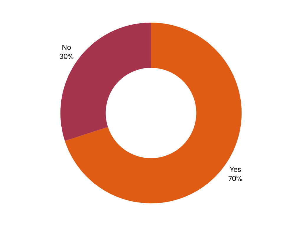
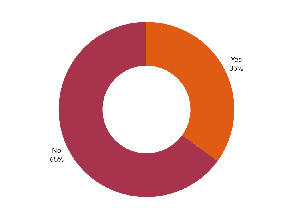
On completion of the qualitative research, I conducted an online survey consisting of 40 participants with questions informed by my qualitative findings based on two cinema apps in Ireland. Below are my findings.
How would you rate the overall visual appeal of the cinema app?
Did you find it difficult to interact with any elements/buttons on the app?
Did you encounter any difficulties reading text while using the app?
Did you find the app tailored to your movie preferences?
Were you able to easily identify the most important information on the app?
Did you receive sufficient feedback or confirmation after completing actions on the app (e.g., booking tickets)?
Key Pain Points
Problem 1: Inaccessible and small targets.
Solutions:
Increase Tap Target Size: Enlarge interactive elements such as buttons and links to improve accuracy and reduce the risk of accidental taps.
Padding and Spacing: Increase padding around targets to prevent overlapping and ensure sufficient space for comfortable interaction, especially on smaller screens.
Problem 2: Uninspiring and generic aesthetics.
Solutions:
Visuals: Provide a more modern aesthetic, including vibrant colours, appealing typography, and sleek UI elements to create a more engaging and visually stimulating experience.
Dynamic Content: Incorporate dynamic content elements such as animations, transitions, and micro-interactions to add visual interest and enhance user engagement.
Branding: Ensure brand impact and consistency are considered and prioritised in the overall design.
Problem 3: Text over imagery and other accessibility issues.
Solutions:
Contrast Enhancement: Improve text legibility by adjusting contrast levels between text and background imagery, ensuring readability for users with visual impairments.
Avoid Text Overlay: Avoid text elements over imagery due to legibility and accessibility concerns.
Problem 4: Cluttered and confusing interfaces.
Solutions:
Simplify Navigation: Streamline navigation by reorganising menu options and consolidating related features to reduce cognitive load and make it easier for users to find what they need.
Hierarchy: Establish a clear hierarchy of information with prominent visual cues (e.g., size, colour, typography) to guide users' attention and prioritise important content.
Problem 5: Lack of Personalisation Features.
Solution:
User Profiles: Introduce user profiles where users can set preferences such as favourite genres, cinemas, and showtimes, allowing for personalised recommendations and tailored content.
Problem 7: Lack of visual hierarchy.
Solutions:
Consistent Design Patterns: Maintain consistency in design elements (e.g., button styles, typography, colour schemes, etc.) throughout the app to establish a cohesive visual hierarchy and enhance usability.
Hierarchy Emphasis: Use visual hierarchy techniques such as size, colour, and placement to emphasise important information and guide users' attention to key elements on each screen.
Problem 8: Lack of adequate feedback.
Solution:
Confirmation Dialogues: Provide clear and immediate feedback to users after completing actions (e.g., booking tickets, updating preferences, etc.) through modal dialogues, animations or toast notifications to confirm successful completion and reassure users.
2. Define
Define
User Journey Map
User Persona
Goal Statement
My goal is to create a user-friendly and informative cinema app aimed at Irish cinemagoers that provides strong brand impact and promotes user engagement to build community.
3. Ideate
Ideate
How Might We…
I used the “How might we…” technique to brainstorm ideas on how I could solve user pain points. Here are some of the questions I posed.
How might I personalise movie recommendations to match users' unique tastes and preferences?
How might I improve the display of screening time information to make it easier for users to find and select suitable movie screenings?
How might I incorporate personalisation and gamification to foster user engagement and encourage regular app usage among cinema-goers?
User Flow
Wireframing
Below are rough wireframes I completed using Balsamiq. Normally, I would sketch on paper at this stage, but wanted to experiment with this online tool.
Ideations
Below are two branding colour and UI component variations that I designed before making a final decision on colour and branding.
Though I liked the first design, I ultimately felt it was too flat and serious for the target market.
The second design had a stronger colour palette, but I felt the images didn’t stand out as effectively.
4. Prototype

Prototype
Hi-Fi Prototype
The onboarding screen of Vista can be customised depending on the current blockbuster the cinema wishes to promote or even the waning film they wish to provide with a boost.
Onboarding Process
Vista’s home screen allows for easy filtering options, without forcing the user to provide all of the specifics before they can search or view the current screenings. This allows users to prioritise a film over a specific date, and vice versa. If users haven’t engaged with the filters, the screen will automatically show the current day’s screenings.
Users can also view a quick synopsis of the film without having to click through to view more information.
Homescreen
The individual movie information pages provide extra details for users such as rating, running time and the last screening of the film.
Users can also read a short synopsis of the film and watch the trailer to guide them in their decision-making.
A share and bookmark option means users can send movie suggestions outside of the app to their friends and bookmark films to their “Want to Watch” section of their profile.
At this stage, users can change their preferred date and time. Progress bars give a visual indication of remaining seats, incase viewers would like to catch a less busy screening or require prompting to book before tickets sell out.
Movie Info
The users’ choices need to remain on the ticket selection section to reassure the correct information has been selected i.e., venue, date and time, before the user proceeds to payment.
Including the poster at this stage, provides the user with a visual cue, giving them immediate feedback that reinforces their actions. Visual feedback is a fundamental aspect of human-computer interaction. It provides a sense of closure which can reduce anxiety and uncertainty, making them more comfortable proceeding with the payment.
Ticket Selection
The seat selection section of the Vista app continues to provide the user with feedback on their choices prior to this stage.
I’ve purposely chosen to include larger targets with simple geometric shapes to make it easier for the user to tap their seat selection.
I think the geometric shapes are a fun alternative from the usual seat shaped icons on other cinema apps, creating a very specific and alternative look and feel for the Vista app. This can contribute to a more engaging and enjoyable user experience, enhancing user satisfaction and brand loyalty. However, I’m conscious this is a departure from usual affordances i.e., a seat shaped icon, and I intend to test the usability of this design thoroughly during the testing phase.
Seating
Once again, the final payment screen provides feedback to the user, assuring them that the correct information has been collected throughout. Users can view their venue along with the screen, date and time, ticket types and quantity, and lastly their allocated seats.
Users can also choose to save cards for quicker payment in future, especially handy if you’re late to the cinema.
Payment
A virtual card appears to users once they’ve successfully completed their booking. This should create a feeling of reward.
An expand icon allows users to view their QR codes and slide between their tickets with ease. Users can also share tickets with other members of their group.
Tickets
Social Sharing
The app’s social sharing features are designed to create community and in-app engagement long after the user has visited the cinema. Users can choose to build social profiles, follow other users, and write film reviews.
Participation in writing film reviews and increasing your in-app socials is intended to encourage loyalty to the Vista cinemas. However, cinemagoers can opt out of having a public profile altogether, if they wish.
During the qualitative research stage, 100% of participants indicated that the current cinema apps in Ireland did not tailor to their personal preferences. This is a potential missed opportunity that could provide cinema apps with increased interaction and the customer with a richer cinematic experience. On the Vista app, users will be asked to input their favourite genres and actors, so that they will receive more relevant notifications through the Vista app helping it to add more value to the user and provide the cinema with helpful analytics.
Personalisation
Notifications
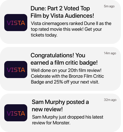
If activated, users will receive notifications that further encourage in-app and social engagement within the Vista app. Users will receive updates about:
New releases of big blockbusters or new releases featuring the user’s favourite actor or film genre, which they indicated through their preference selection.
Reminders of the last showings from the “Want to Watch” list.
The highest-ranking films as voted by other users.
Badges and discounts for their critiques and milestones e.g. 100 reads, 10th review, etc.
Updates on new reviews written by people they follow.
5. Test
Test
Usability Testing
A total of 8 participants, were recruited to take part in usability testing sessions for the Vista cinema app. Overall, they were “highly satisfied” with the Vista app and the features offered e.g. personalisation features and community-based film reviews.
Based on the participant’s feedback I’ve made a number of changes, which you can see outlined below.
Featured Reviews
8 of the 8 participants agreed a featured review would be helpful on the individual film pages. For this reason I’ve added a featured review, featuring either the most-read review or the review written by the user with the highest number of reads or followers overall.
Before
After
Ticket Confirmation
3 of the 8 participants indicated that they felt there could be better feedback after they purchased tickets successfully. For that reason, I’ve added explanatory text once payment has been confirmed.
2 of the 8 participants stated it would be helpful to add the amount of tickets purchased in text format, so I’ve added a label that will display the purchased ticket amount to the user.
Before
After
Profile
3 of the 8 participants expressed that too much of the screen was taken up by user information, so I condensed the top section of the user profile to take up less screen space.
4 of the 8 participants didn’t like the shape of the user profile. One participant indicated that they felt it looked a bit like a “montessori star”, so I’ve replaced it for a circular profile picture.
The majority of participants stated that they’d prefer the option to see multiple reviews, rather than one featured review on the profile page. I’ve replaced the featured review component with an archive of reviews that can be toggled through using a swiping action.
In discussion with participants, it also became clear that adding “Offers” and “Badges” to the lower menu would also prove useful to users.
Before
After
What’s next?
The Vista cinema app is a concept app, however, in a real-world scenario I envision multiple possible developments and expansion of the online community.
These include:
Introduction of an analytics dashboard, allowing users to review follower engagement and interaction
Introduction of established review profiles e.g., Rolling Stones, Chris Stuckmann, etc. enhancing the credibility and authority of user-generated content
Integration of video reviews, offering users an enhanced dynamic platform
Vista organised community-driven events e.g., movie nights, Q&A sessions with industry professionals, or movie-themed contests and challenges
Facilitating collaboration and co-viewing experiences by enabling users to create and join groups, share watchlists, and coordinate movie outings


